
SAMPLE OF WORK
Over the years, we've learned that showcasing all our work at once is impossible, so we’ve handpicked a selection to give you a glimpse of what we can achieve together at Emerger. If you connect with our vibe but don’t see exactly what you’re looking for, reach out. We can curate a portfolio tailored to your business challenge and industry. Rest assured, we have something relevant to share!

PROVIDENCE PROPERTY
Strategic clarity. Elevated brand. Better leads.
Providence Property is Australia’s most trusted buyer’s agency. Founded by a trio of directors with deep experience in banking, finance, and property investment, the firm is known for helping busy professionals and business owners grow wealth through a clear, methodical approach to property acquisition. But while their results were solid, their brand position, branding and digital presence didn’t reflect the calibre of what they delivered—or where they were headed. We ran interviews & workshops with the directors and key stakeholders to solidify the why and who of the business to drive clarification before amplification.
-
The Challenge
We were brought in to help realign their brand with their ambitions: elevate their presence, sharpen their messaging and improve lead conversion. But it quickly became more than a branding job. Through an intensive strategy sprint with the three Directors, we worked to align on a shared vision, define buyer personas, clarify the full scope of services and map content around key sales moments. That commercial clarity formed the backbone of the new identity, tone of voice and website, which now positions Providence as the confident, contemporary business it is.What we delivered is more than a visual upgrade. It’s a cohesive, senior-led brand system designed to support their growth targets, attract the right clients and move prospects through the pipeline faster.
The feedback has been instant and overwhelmingly positive, with stronger engagement and higher-quality leads from day one.
Our Approach
Brand strategy
We began with a full strategic discovery, working directly with Providence’s three Directors to define their business objectives, ideal client profiles and points of difference in a crowded market. This strategic alignment helped crystallise the brand’s role, not just as a professional services firm, but as a long-term growth partner for ambitious investors.Brand identity
With clarity around the brand’s future direction, we developed a sophisticated new identity system built on confidence, clarity and trust. From logo to layout, every design element was crafted to convey a sense of precision, assurance and quiet excellence: mirroring the client experience Providence delivers behind the scenes.Tone of voice
We crafted a verbal identity that matched the team’s professionalism and direct approach. Striking the right balance between expert and approachable, the new tone of voice helps cut through industry jargon and speak plainly to busy professionals who want results, not fluff or promises that cannot be delivered.Website design & copy
The website was completely reimagined to better reflect the calibre and clarity of the business. With targeted messaging, intuitive structure and frictionless pathways to conversion, the site now works as a strategic tool: attracting the right leads, building trust early and guiding users toward the next step with confidence.Creative direction
We led the creative vision across every touchpoint, ensuring cohesion between brand identity, messaging, imagery and user experience. This included direction on videography, photography, content hierarchy and design cues that reinforce Providence’s premium positioning, while maintaining warmth, relatability and authenticity.UX mapping
To streamline user journeys and drive stronger engagement, we mapped the entire site architecture around buyer intent and decision-making behaviours. Every page was designed to answer a specific question, overcome a common barrier, or move the visitor closer to enquiry: resulting in faster, more qualified leads from day one for the team.
Part of the strategy was retiring the old identity which was perceived to be industrial and impersonal. We developed a new Providence Property logo that centres on a refined, approachable and modern ‘P’ — a symbol of both legacy and leadership. It reflects the brand’s deep experience and forward momentum, signalling a business that’s not just active in the market, but shaping it. Designed to inspire trust, the mark conveys confidence, progress, expertise, clarity and a constant evolution — just like the clients it serves.

“Working with Directors of another business on a strategic level to deliver an impactful outcome for us was game changing. From the very first conversation, it was clear this wasn’t just about a new identity or website: it was about our growth targets, sales cycles, leads and expectations. They took us through a full end-to-end consultation with our three Directors, helping us align on the future direction of the brand and stay focused through every stage of delivery. Having only senior people in the room made the process fast, fluid and really pushed us. Their strategic guidance was invaluable, not only in building a compelling brand and website, but also in refining our marketing to attract the right leads and shorten our sales cycle. What we have now is more than a new look. It’s a clear, confident brand presence that reflects who we are and where we’re going. The feedback from clients has been overwhelmingly positive and more importantly, we’re seeing faster engagement and better quality conversations from day one.”

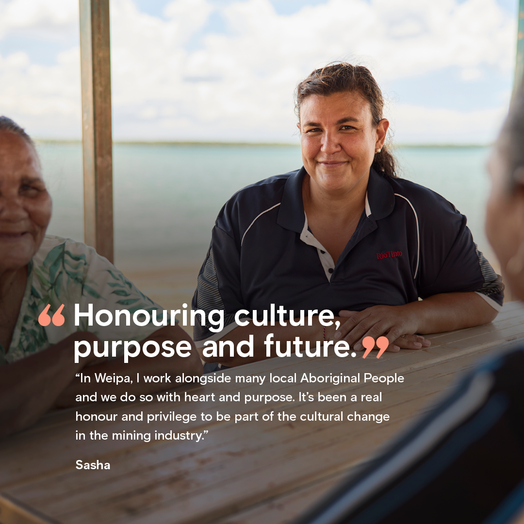
RIO TINTO: INDIGENOUS RELATIONS

What can we be, together?
Rio Tinto set out to shift perceptions and culture by demonstrating the company’s commitment to retaining, growing and attracting Indigenous talent across its Australian operations. They needed a way to make that commitment real, visible and relatable so we partnered with Rio to design and deliver their first external storytelling-led campaign that put Indigenous voices at the centre. Through the personal experience of Indigenous leaders we created emotive films, on-Country photography and authentic narratives, we helped the business connect hearts and minds to a bold vision: What we can be, together?
-
The Challenge
Following a period of deep reflection, Rio Tinto set out to build a stronger foundation for cultural safety and Indigenous leadership across its operations in Australia. While incredible programs and partnerships were already underway, the challenge was visibility. How do you show, not just say, that change is happening? And how do you invite others to be part of it?
Our Approach
We gained insights through interviews and workshops focusing on respect and connection. We brought the findings to life through powerful storytelling; built on truth, trust and shared purpose. From early strategy through to filming on Country, we worked alongside Rio leaders and Indigenous employees to co-create a campaign that could shift internal mindsets and raise external awareness.Services Provided
Research & stakeholder discovery – Deep dive into audience mindsets, leadership priorities and business tensions around Indigenous inclusion. Included a series of research interviews with the selected talent to define the story arc for this campaign in a compelling and authentic way.
Creative strategy – Defined the campaign territory, emotional drivers and messaging architecture to ensure alignment with Rio’s cultural change goals - as well as the greater brand as a whole.
Concept development – Crafted the central idea “What we can be, together” as a unifying message across multiple audience groups and content formats.
Scriptwriting & storyboarding – Wrote and structured all narrative elements, including a hero video script, 11 personal stories, interview frameworks and visual graphic treatments.
Interviewing & directing – Conducted on-camera interviews with Indigenous and non-Indigenous talent across seven locations, capturing lived experience with care and cultural sensitivity.
Photography & filming – Led production across WA, NT and QLD, creating portrait and action-based imagery and emotive video content on Country, in community and on site.
Post-production & design – Delivered campaign-ready digital and print assets to complement the suite of videos. We also partnered on the landing page design for the videos and delivered social-ready formats for driving traffic to the website.

Assets Created
1 x hero campaign video (60-sec brand film)
11 x individual story films (3–5 mins each)
150+ campaign and brand bank photographs assets
Digital, print and web design assets
Messaging framework and creative toolkit for future use


Visit Rio Tinto to see how the full campaign came to life.
